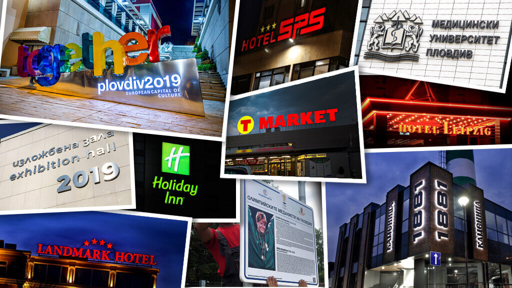
And this year almost slipped from our fingers – the 27 years for Media Design. For more than two decades we manufacture projects, which realization brings us wonderful moments from the oldest-alive city in Europe.
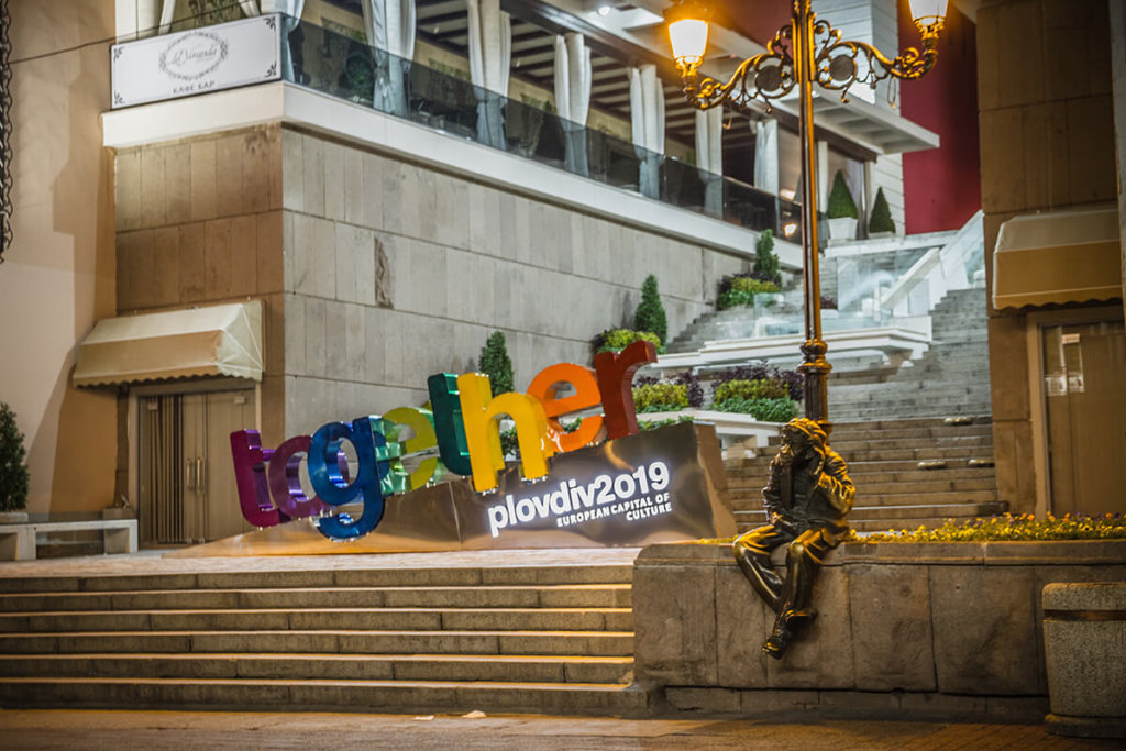
1. Channel letters together
The channel letters “together” turned to a landmark just hours after they were installed. Hundreds of visitors and citizens in the city do not miss the opportunity to take a picture next to them. We are so proud of the fact, that we stand behind the manufacturing and designing the logo for Plovdiv – European Capital of Culture for 2019.
The attractive designer letters was developed 3 years ago by the order from Municipality of Plovdiv and reflects the slogan of the past 2019. The year was filled with dozens of cultural events and interactive events, which transformed the appearance of the city and the daily life of its citizens.
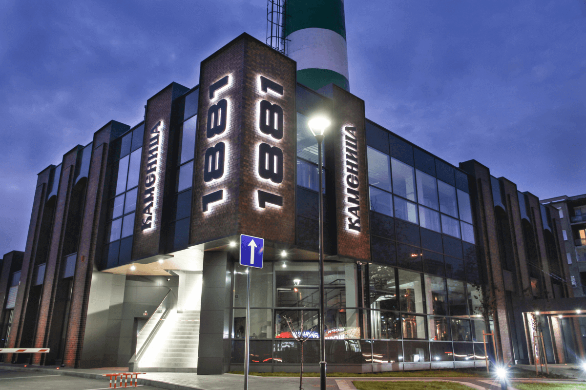
2. Illuminated letters for brewery Kamenica
“Kamenica”- emblematic beer at the city under the hills is one of its distinguishable sides. After the complete changes and the changes at the production base at the brewery, she transformed into an entirely different kind. At the new brewery “Kamenica” there will be micro craft beer, restaurants, and shops. And here Media Design has the privilege to participate in the building of the whole vision for the new site.
The illuminated back of the facade letters of the visitors center and the restaurant with him gives a complete look at the facades. The quality of work done is proven with the inox using, car paint from the highest class, and LED modules with long warranty gives us calmness, that these letters will continue to glow even after the warranty period.
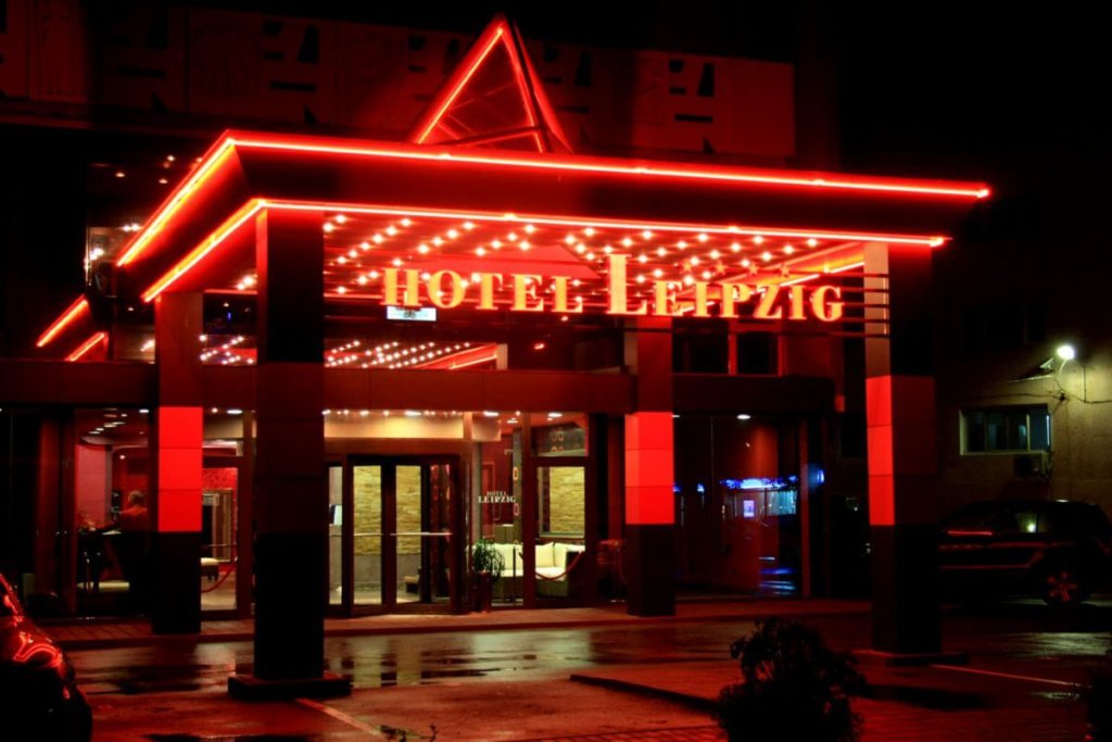
3. Letters at hotel Leipzig
Name known to all citizens that live in Plovdiv, Hotel Leipzig, one of the iconic places in town. Part of the warm welcome at Plovdiv. For them, we designed an announcing sign for the entrance at the hotel and also for the restaurant.
For them, we have developed all advertising lettering – at the entrance door, at the roof, and the letters at the restaurant.
We put a lot of effort and precision into the letters of cafe-garden L Garden.
4. Whole branding for hotel Holiday Inn
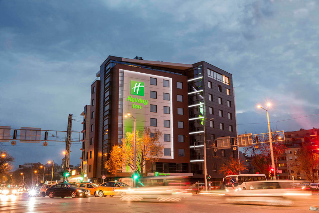
“Holiday Inn” – an international chain of hotels with a recognizable logo for the whole world became part of our city. The business hotel is located at the wide center of the city and it’s proven with its quality, good services, and warm coziness. “Holiday Inn” choosed to trust us at our 27 years of experience in the advertising business for the branding of their hotel.
All advertising-informative elements are specified by the brand and are being controlled by the managers at the store chain. We covered the high requirements and the result that we got is really impressive. Thank you for the trust of the investors.
5. Alley of Olympic Glory
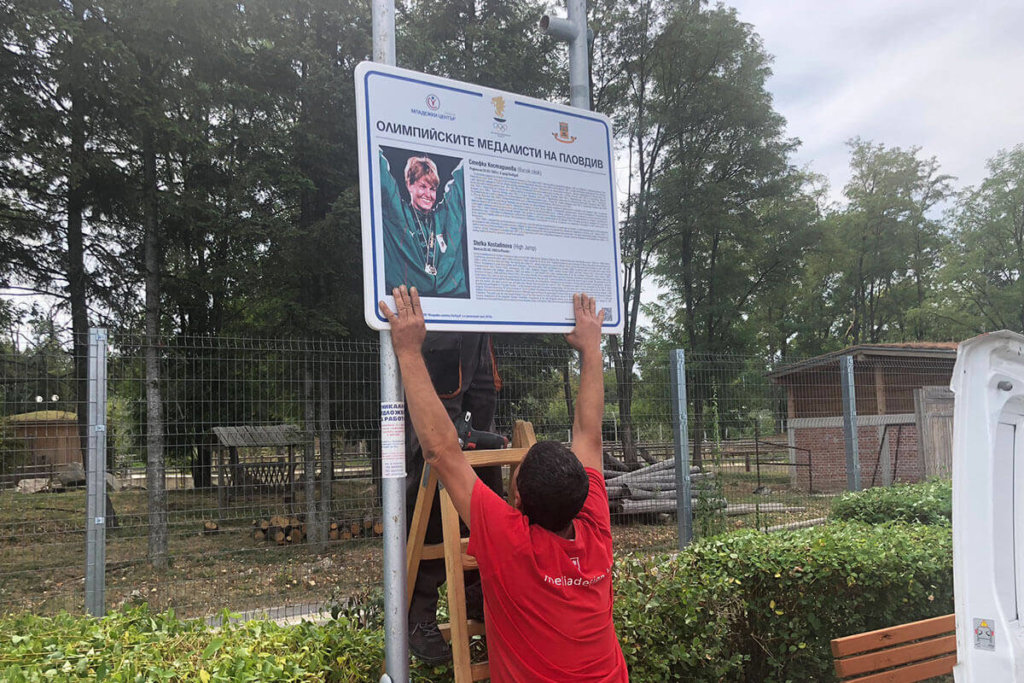
To revive some of the most glorious moments for the Olympic heroes of Plovdiv and to stimulate and maintain the enthusiasm of more children and young people, Media Design developed 46 informative signs – for every one of the champions.
By initiative from “Plovdiv Municipality” and Municipal Enterprise “Youth Center Plovdiv”, we mounted signs along the pedestrian zone at the “Grebniq Kanal’, supporting the Olympians who glorified our city.
6. Branding the facade of hotel SPS
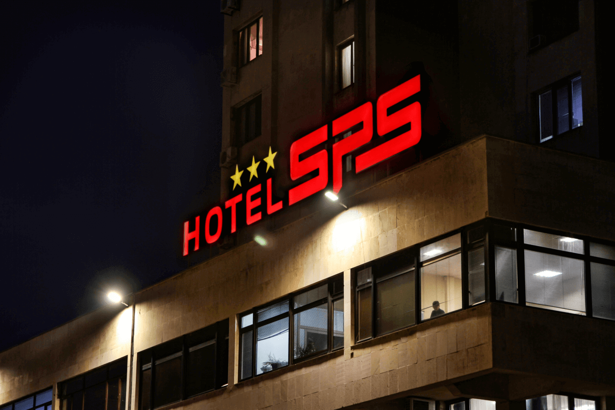
We removed the dust off another iconic communist-era building. The giant 16-floor hotel at the entrance at JK Trakia can be seen from kilometers. The characteristic cube at the roof with letters SPS for decades it served as an orientation in the city.
After the change of ownership at the hotel, the new owners decided to change its vision. Starting from dressing the giant cube with an illuminated sign, new channel letters, hotel SPS shined with a beautiful and noticeable new vision.
7. Giant advertisement for T-MARKET
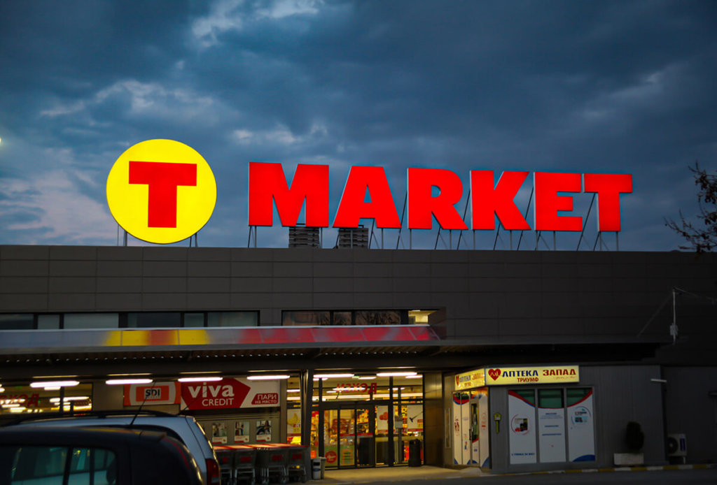
The emblematic store at the city under the hills, which referred to as Sani, later it was renamed to Triumph, became the flagship of T-MARKET stores. The location of the client allowed us for easy and fast movement, which helped with the installing of the giant letters.
Manufacturing this type of giant advertisement is not an easy job but our experienced and highly-qualified professionals managed to do it just in time. The logo of the T-MARKET was placed successfully and now it welcomes visitors with effectiveness.
8. Hotel Landmark Plovdiv with effective advertisement
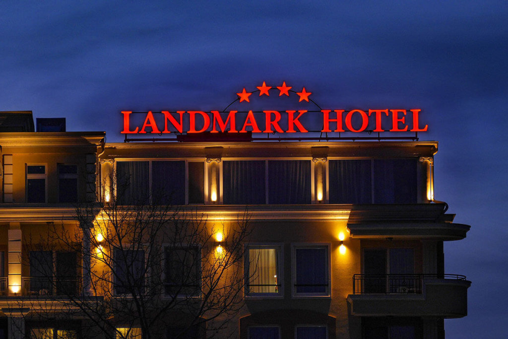
“Grebna baza Plovdiv” is one unique place, made especially for boating. The conditions and microclimate of the elegant cable bridge make this preferred place for sport and relaxation. Hotel Landmark is located in the western part, there is almost no place from where you can’t notice the advertising channel letters.
The hotel combines a luxurious and elegant style, which allows the visitors opportunity to feel and experience “the magic of Plovdiv”.
9. Metal letters installed at Exhibition hall 2019
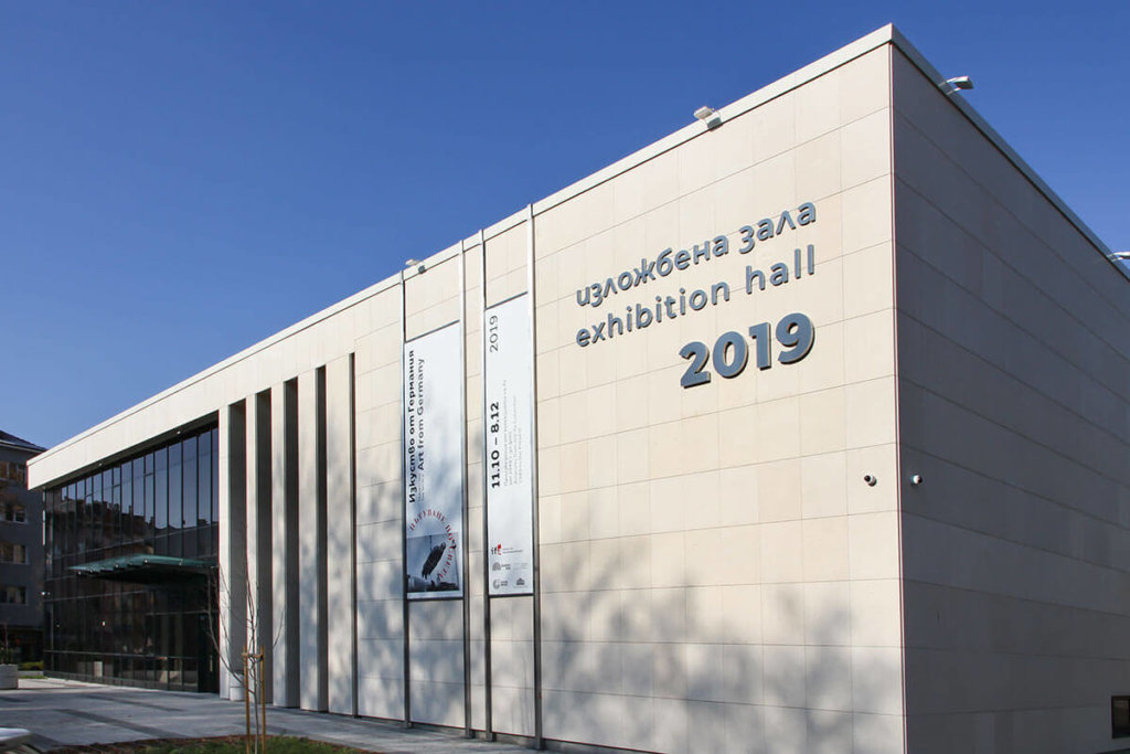
“Exhibition hall 2019” is located at ul. Gladstone 32 at the city’s center and it’s called that in honor of the city dignity – European Capital of Culture for 2019. The elegant metal letters, which we manufacture for the hall, fit perfectly with the minimalism on which the gallery was opened. The exhibition hall fastly transforms into a preferred place for painters, artists, and any art cultural events.
To this day, world famous names joins and takes place at the hall, to present their latest inventions.
10. Logo for Medical University Plovdiv
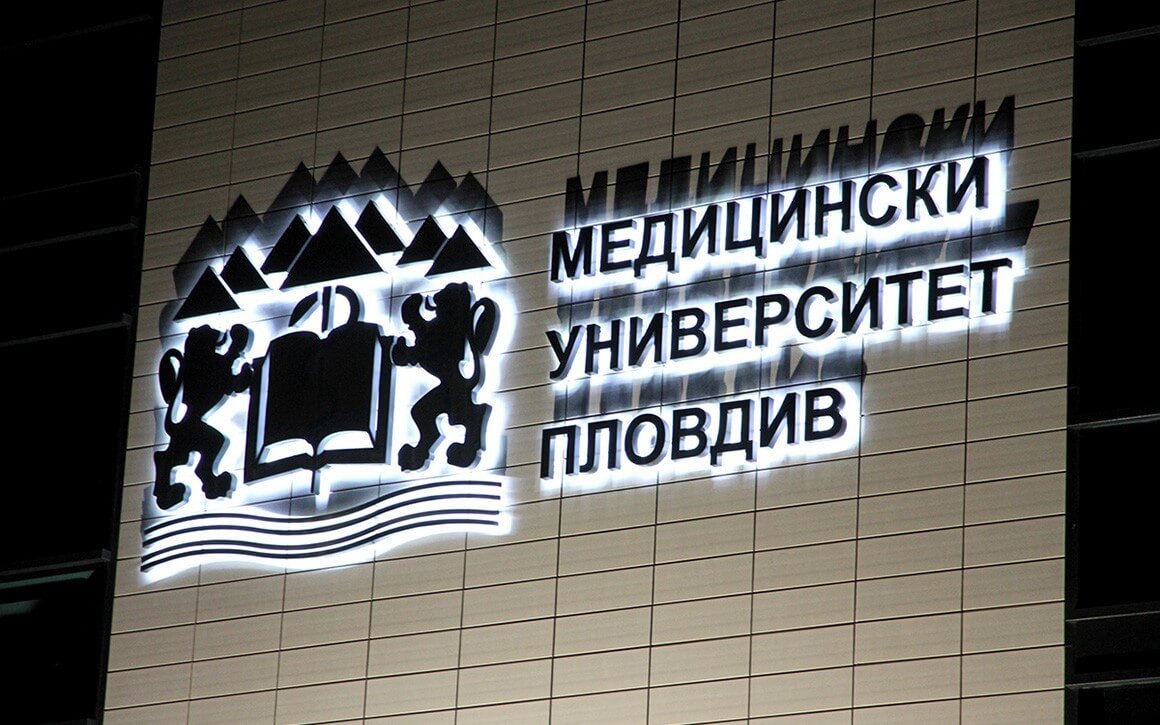
Our designers achieved a logo for the Medical University Plovdiv over 15 years ago. It fits perfectly with the good image of the university, by combining important for the elements. For them, we installed metal letters with backlit illumination, that fulfill the good name of the university.
Whether day or night, the advertisement always look attractive.
