Helvetica belongs to the sans-serif fonts family, also known as grotesque. You can find it literally everywhere: computer screens, billboards, buildings, street signs, and posters.
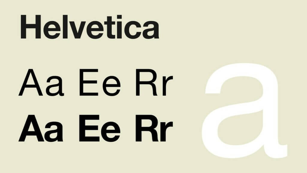
The first version of Helvetica was created in 1957 by Max Midinger, a Swiss font designer. His goal was to design a new font without serifs that could compete in the Swiss market. The idea was for a neutral font, which does not give additional meaning to the advertising design. Since its inception, it has become a cult in the design of company logos, making it one of the most common designs of all time. But like any icon, Helvetica is divided and many designers find it unoriginal, uninspired, and unattractive.
The name Helvetica has a complicated history. In fact, the font was named so only four years after its announcement. It was originally called “Neue Haas Grotesk” – a boring descriptive nickname that includes the name of its manufacturer (the Haas foundry), the design type (neo-grotesque or realistic), and the fact that it is new (or “neue” in German). The name Helvetica means “Swiss” in Latin as a tribute to the origin of its creator, and was changed in 1960 to facilitate its sale abroad.
Why has Helvetica ruled the world for more than 60 years?
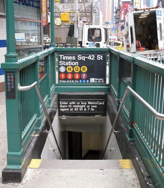
Legendary designer Massimo Vinelli, who uses Helvetica for the New York subway system, said in Gary Houstwith’s 2007 documentary: “There are people who think the font should be expressive. They have a different point of view than mine. ”Its combination of features or lack thereof turned out to be exactly what the designers were looking for:“ Helvetica appeared in the right place, at the right time, ”says Ellen Lupton, contemporary design curator at Cooper. -Hewitt, Smithsonian Museum of Design in New York. “It provided something the designers wanted: a font that was obviously with no personality. Other popular grotesque fonts that existed at the time, such as Gill Sans and Futura, had a stronger identity and more distinctive geometric shapes. ”
Not long after, Helvetica became the standard for advertising and corporate branding in the United States: In 1967 he sneaked into the design of the Yankee Stadium, and by 1968. is everywhere in America. With its straight lines and modern look, Helvetica is used in many company logos and other marketing materials we see today. Some corporations that use it in their logos are Apple, Microsoft, 3M, American Airline, Jeep, Verizon, and many others. It is slowly and surely conquering the whole world with its practicality, and even designers who don’t like it say that they respect the popularity that the font has achieved.
How to recognize Helvetica?
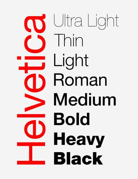
Helvetica can often be confused with other san-serif fonts, such as Arial, but it has more details that set it apart from other fonts. Helvetica characters have vertical or horizontal endings in the stroke. It focuses on the space around the letters. It’s also easy to read on the go, which is why you often see this font used for airlines or car logos. Helvetic variations have continued to grow, relative to the popularity the font is gaining.
Helvetica variations have continued to grow, relative to the popularity the font is gaining. Some of these variations include:
Helvetica Light: Designed by Erich Shultz-Anker and Arthur Ritzel.
Helvetica Compressed: Designed by Matthew Carter.
Helvetica Rounded: Designed in 1978, incorporating a more rounded letter design.
Neue Helvetica: Redesign of Helvetica in 1983, which gave the font a more uniform height and width.
Aesthetic dilemma nowadays
Aesthetic dilemmas, which require the image of each brand to look clean and friendly, are quite obvious. We have to trust various applications and sites on a daily basis, sharing personal information such as search history, location, email, chats, etc. This data is recorded to help advertisers contact us more effectively.
Curiously, the grotesque or serif-free Victorian fonts have come to represent the accessible and widespread, desired mediocrity. What was once thought to be right – traditional serif-based fonts – are most common in counterculture: tattoos, graffiti, and hipster zines.
When it comes to advertising and digital marketing, if you want to convey a specific message to your audience or you are looking for a font for your next project that is modern but still has a classic feel, Helvetica may be exactly what you are looking for.