Introduction
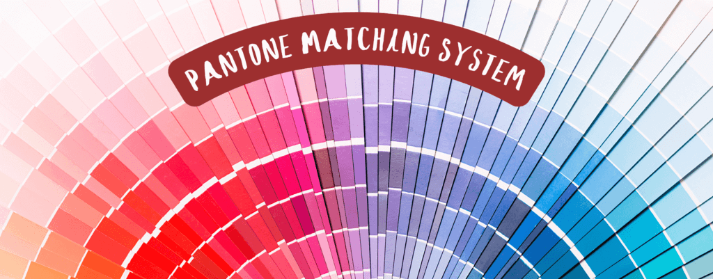
The Pantone company and its Pantone Matching System are essential tools for anyone who needs promotional materials and aims for precision in color printing. Whether you are a business owner or you work in the advertising industry, understanding Pantone can play a crucial role in the success of your projects.
The history of Pantone
Beginning in New Jersey in the 1950s as a small manufacturer of color cards for cosmetic companies, Pantone changed the course of industrial history forever when it was acquired by Lawrence Herbert in 1962 and subsequently developed into one of the most influential and recognizable brands in the world of color production. Herbert, and his vision and passion for industrial design, succeeded in transforming the small business into a global leader by developing the innovative and world-renowned color system, the Pantone Matching System (PMS for short). Since then, PMS has become synonymous with color accuracy in printing and consistency in color production.

What is the Pantone Matching System?
You are probably wondering why the PMS color matching system is so crucial nowadays. The reason lies in its impact on the standardization of color in almost every type of industry – from fashion and graphic design to manufacturing and digital media. Pantone provides a universal method for accurately communicating color parameters between designers, manufacturers and other professionals in different industries around the world, thus ensuring unconditional consistent color matching in printed materials.
For international chains using different materials or printing techniques, it is the ability to achieve a perfect color match that is decisive for the quality of their final products. In branding, Pantone colors help maintain the visual identity of the label. Some companies, such as Tiffany & Co., have even trademarked certain Pantone shades as part of their brand identity in order to create effective and immediate associations with it in the public domain.
Understanding Pantone color numbers
At the core of the PMS system is the unparalleled precision achieved by having each color assigned a unique number, known as a Pantone number. It is the Pantone numbering that prevents confusion and variation which are a common problem with something as subjective as reading color descriptions or handling different display settings. For example, “navy blue” can be interpreted in a variety of ways, but “Pantone 294 C” defines a specific blue shade that remains consistent whether printed on paper, textiles, or viewed in digital format. It is this last aspect that underscores the importance of PMS for successful color standardization.
Pantone colors on screen vs. in real life

The colors we see on our screens don’t always match those printed or on a textile surface. This discrepancy arises from the differences in how colors are reproduced digitally versus in the physical world. Screens use the RGB color model (Red, Green, Blue), to reproduce a color visually. In this, we get closer and closer to white with each addition of color. In contrast, printing relies on the CMYK model (Cyan, Magenta, Yellow, Black), which starts with a white material base and applies ink to create other colors.
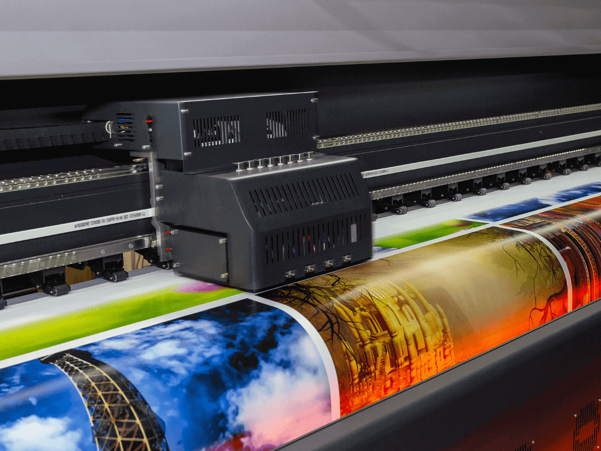
Other factors, such as printer color range, the qualities of the material, and mismatching between the rendering on different screens, can also contribute to color inconsistencies. Pantone bridges this gap by offering color swatches and standardized color palettes, visualizing how a color will look in physical form. This ensures a seamless transition from digital media to printed materials, which is particularly noticeable in promotional items produced with ultra-precise printers such as those for high-quality solvent printing where even the smallest details are essential.
Pantone chooses “Color of the Year”
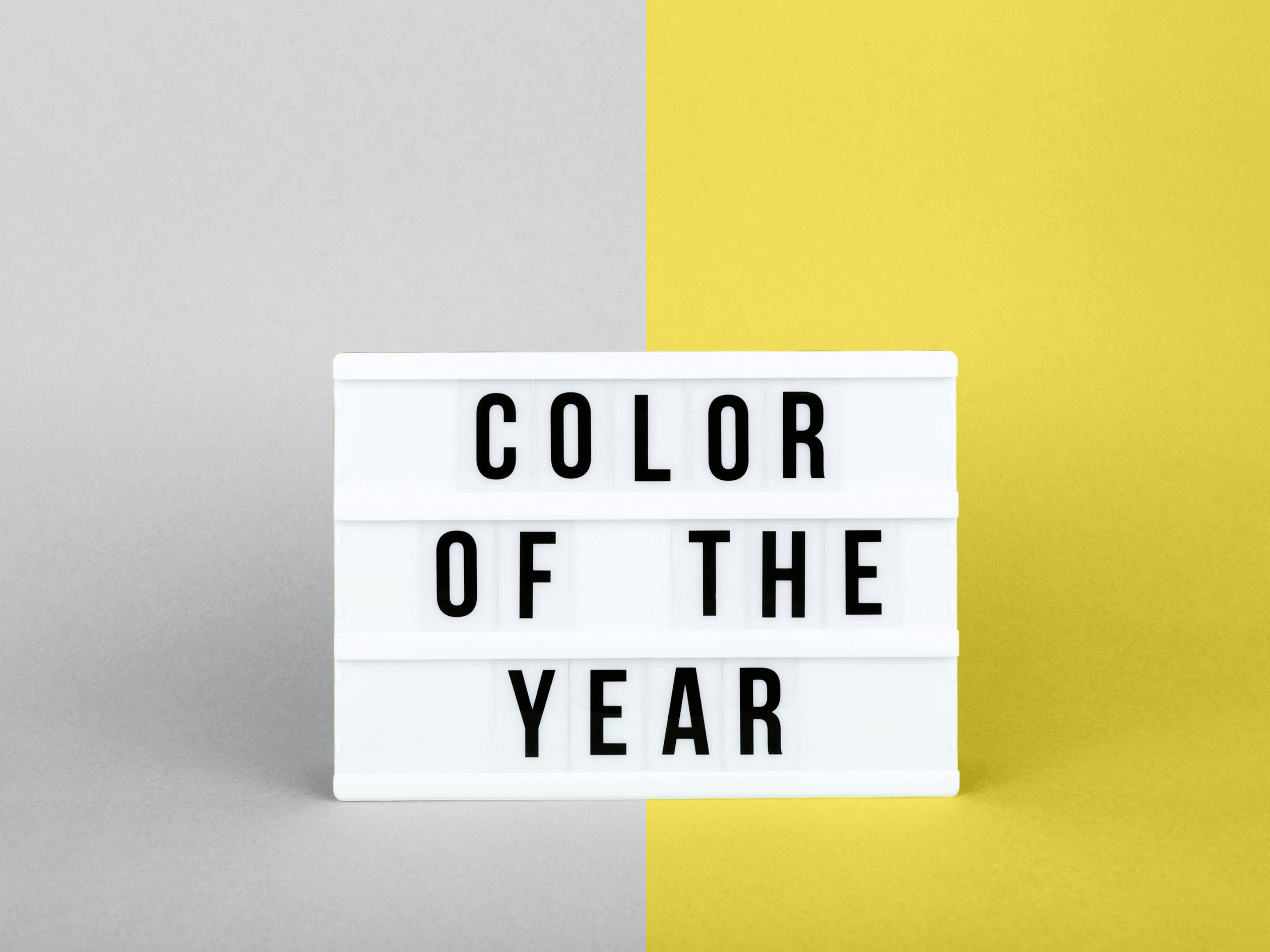
Pantone’s influence grew even stronger when the company introduced the “Color of the Year” initiative in 2000. Here, a group of color experts gather annually and study current global trends, social and cultural changes, and economic conditions to select a color hue that reflects the collective mood and aesthetic direction for the year ahead. For instance, pictured here are the two colors chosen for 2021, which symbolize both the uncertainty and persistent hope that marked a turbulent 2020.

The “Color of the Year” event is of international significance and dictates the decisions of designers, manufacturers, and marketers who often incorporate these colors into their collections and campaigns. But it’s not just the colors that win this annual vote that influence global consumer trends. Interestingly, Pantone also made headlines with “Pantone 448 C”, dubbed the “world’s ugliest color”, a murky mix of brown and olive green. The infamous color was subsequently used in cigarette pack designs in Australia with the aim to attract as few buyers as possible.
Pantone’s color standardization and initiatives like “Color of the Year” are clear indicators of the strategic role that colors play in modern society. Colors can evoke emotional reactions, influence consumer behavior, and strengthen brand identity. Through its patented systems and continued innovation, Pantone has solidified its position as a leading force in the world of color – from its founding in 1962 to its ongoing relevance today.
