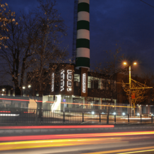
It is well-known that Kamenitza Brewery is one of the emblems of Plovdiv. It was established in 1881 by three Swiss entrepreneurs. On its place, there were stone quarries. This neighborhood was called Kamenitza and later it was used for the brewery name. For more than 120 years it has been a symbol of high-quality beer manufacturing and excellent taste. After the management was changed the brewery is owned by American-Canadian company Molson Coors. The new owner has been constructing a modern Kamenitza Brewery which will include a craft brewery, restaurant, shops, and more.
Although the project is not completed, Media Design has started brewery branding.
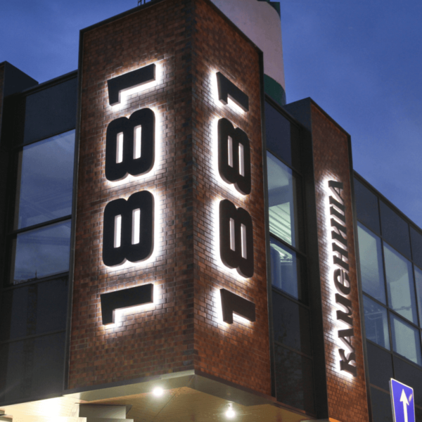
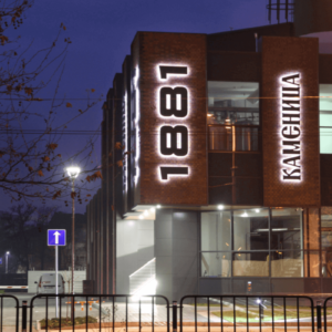
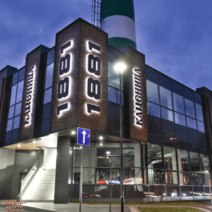
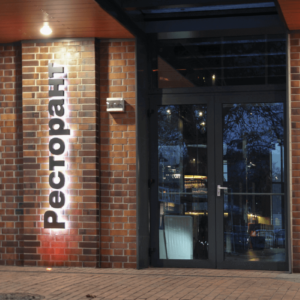
Following this project, we produced channel letters Kamenitza, the year of establishing the company (1881) and restaurant lettering with great responsibility. All the lettering was situated along the two sides of the building entrance.
How did we produce channel letters for Kamenitza Brewery?
We used high quality stainless steel (inox) that was powder coating painted in the color of the logo. The most attractive element of the lettering Kamenitza is its halo lit. Channel letters were installed away from the wall, using standoffs. The light is directed towards the back and is scattering around the letters which is called halo effect. This way of lighting outlines the lettering clearly, increasing the brand awareness.
We ensured bright and long-term illumination of the historical emblem Kamenitza Brewery, using the Korean LED modules – G.O.Q. LED.
The modern Kamenitza Brewery will be available for all the residents and tourists in Plovdiv to enjoy the lovely beer taste.

